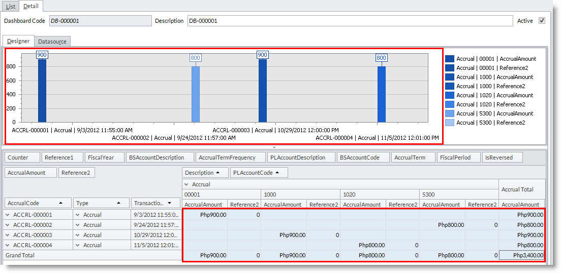
Design the Chart
|
Content
|
|---|
To customize the look of the chart and add more details on its view, the following options will help you easily interpret information on your data. Click on the Preference button from the menu options to start selecting options.
Graph Preferences
- From the Business Intelligence Designer detail screen> Preference.
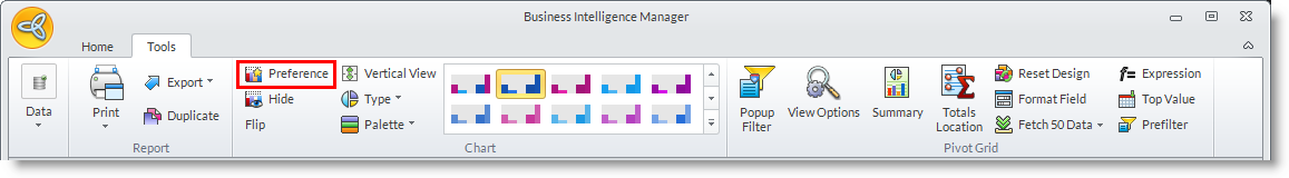
- The Preference Screenwill appear. Refer to this image for the following preference settings:
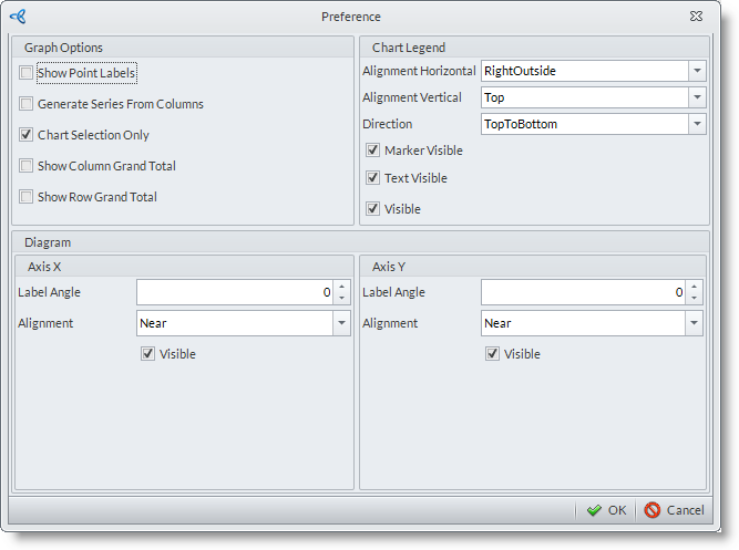
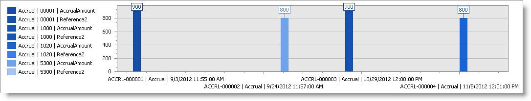
- Show Point Labels
If checked, enable viewing of each data point in the graph. Uncheck to hide the point labels.
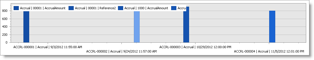
- Generate Series From Columns
If checked, allows viewing of column data along the x axis on your chart instead of the usual row column viewed on the x-axis.
- Chart Selection Only
When checked, allows you to create a chart when data items are selected in the pivot grid. By default, Chart Selection is already checked in the system.
- Show Column Grand Total
When checked, allows you to include Column Grand Total on the chart. Uncheck to hide the Column Grand Total on the chart. - Show Row Grand Total
When checked, allows you to include Row Grand Total on the chart. uncheck to hide the Row Grand Total on the chart.
- Show Point Labels
CONFIGURE CHART LEGEND
From the Preference form, you may also set the alignment of the chart legend.
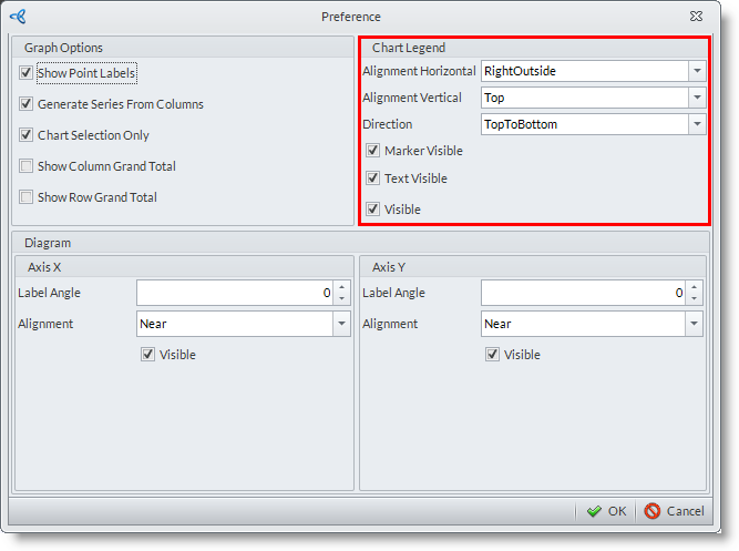
- Alignment Horizontal
when legend is set as visible, you can customize the alignment of the legend horizontally. The options to select are:
- LeftOutside
- Left
- Center
- Right
- RightOutside
- Alignment Vertical
- TopOutside - aligns the legend on top of the chart but is outside the area of the chart.
- Top - aligns the legend on top of the chart and inside the area of the chart.
- Center - aligns the legend at the center of the chart and is inside the area of the chart.
- Bottom - aligns the legend at the bottom of the chart and is inside the area of the chart.
- BottomOutside - aligns the legend at the bottom of the chart but is outside the area of the chart.
- Direction
- ToptoBottom
- BottomtoTop
- LefttoRight
- RighttoLeft
- Marker Visible
When checked, includes the marker on the legend. Otherwise, if left unchecked only the text will be seen on the legend. - Text Visible
When checked, text of the data will be visible on the legend. Otherwise, if left unchecked only the marker will be seen(when checked). - Visible
This will only be visible when marker and text visible options are also checked.
CUSTOMIZE THE POSITION OF THE AXES DIAGRAM ON THE CHART
This applies to both X and Y axes.
For X-Axis
- Label Angle - set the degree of inclination of the label. Positive quantity sets the label downwards, negative quantity sets the label upwards.
- Alignment - sets where the label should be placed relative to the axis.
- Near - places the label below the x-axis.
- Far - places the label on top of the x-axis.
- Zero - places the label after the zero-point.
- Near - places the label below the x-axis.
- Visible - when checked, enables the label to be displayed on the chart.
For Y Axis
- Label Angle - sets the degree of inclination of the label. Positive quantity sets the label downwards, negative quantity sets the label upwards.
- Alignment - sets where the label should be placed relative to the axis.
- Near - places the label on the left side of the y-axis.
- Far - places the label on right side of the y-axis.
- Zero - places the label above the zero point.
- Near - places the label on the left side of the y-axis.
- Visible - when checked, enables the label to be displayed on the chart.
![]()
Business Intelligence Chart Types
|
Chart Thumb Preview |
Description |
 |
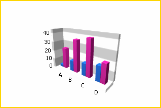
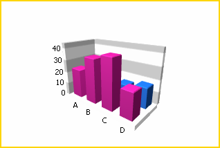
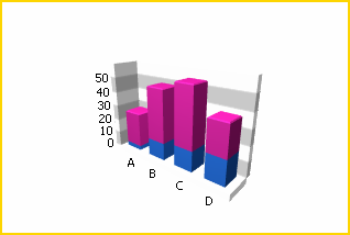
Bar chart – also known as the side by side bar chart, is represented by a series of horizontal or vertical bars that is grouped by category with which the length of the bar is determined by the value of the series. |
 |
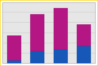
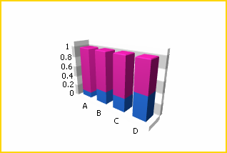
Stacked Bar – displays all points from different series that is stacked in single bar. The length of the bar is determined by combined values of the series for each category. |
 |
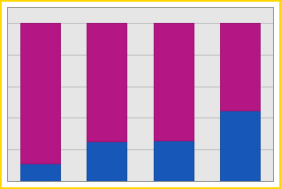
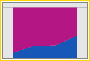
Full Stacked Bar – displays all series stacked in a single bar for each category in which the height of each bar is always the full height of the chart diagram. |
 |
Side by Side Stacked Bar – is a combination of the stacked bar and the side by side bar chart. It is helpful when stacking different bars and combines them into groups shown side by side across one same axis. |
 |
Side by Side Full Stacked Bar - combines the advantages of both the Full-Stacked Bar and Side-by-Side Bar chart types, so that you can stack different bars, and combine them into groups shown side-by-side across the same axis value. A Side-by-Side Full-Stacked Bar chart can display series containing data points with positive or negative values. However, a series with positive values is stacked only with other series containing positive values; and a series with negative values is stacked with other series containing negative values. If a series contains data points with both positive and negative values, it is treated as a series with positive values, while all its negative values are treated as zeros. |
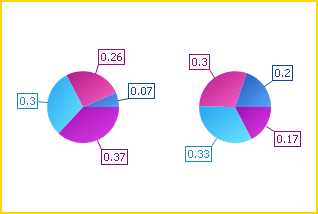 |
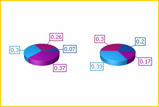
Pie – displays sets of pie charts with series’ values displayed in percentages. |
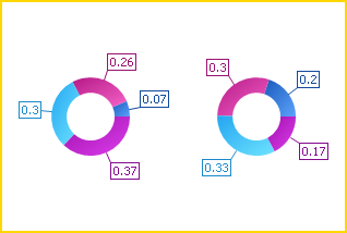 |
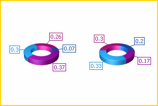
Doughnut – this chart type is necessary only when comparing percentage values of the same series but is easier to understand due to the display of the sliced pie with a hole at the center. |
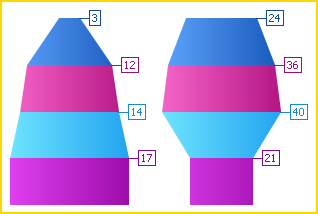 |
Funnel – displays a wide area at the top which indicates the total point’s value, while other areas are proportionally smaller. This chart is potentially helpful in identifying problems in an organizations’ sales processes. |
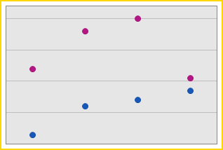 |
Point – displays points from two or more different columns or rows on the same plot. |
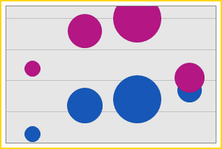 |
Bubble – displays a representation of data with third dimension that is expressed in the size of a bubble. |
 |
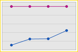
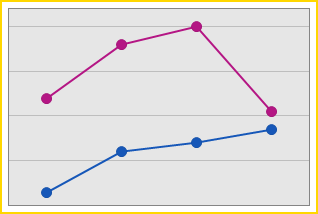
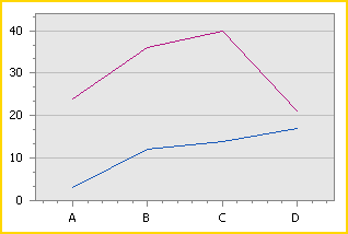
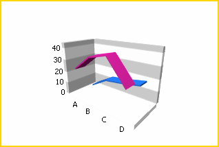
Line – shows trends for several data on the same diagram plotted against the x and y axis. |
 |
Stacked Line – displays all points from different series but with the same argument in a stacked manner. It is useful when comparing how much each of the data series adds to the sum of the aggregate value for a specific column or row value. |
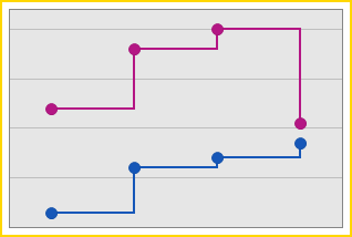 |
Step Line – this chart is useful when you need to track data changes over time. |
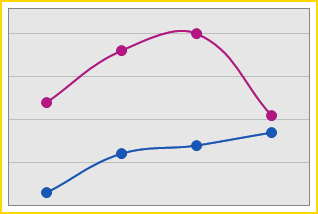 |
Spline – charts that are specifically used for plotting curves through data points. |
 |
Scatter Line – a chart that displays series of data points in the same order within the collection of data. |
 |
Swift Plot – is chart that displays similar to the scatter line without the data points from the series. |
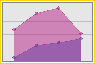 |
Area – is a chart that displays data series as filled areas in the diagram. Each point is displayed as peak or hollow in the area depending on the value of the data points. |
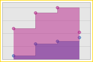 |
Step Area – is chart that represents series of the same data in a step lines filled with an area. |
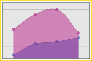 |
Spline Area – charts that are specifically used for plotting curves through data points but with area filled in the diagram. |
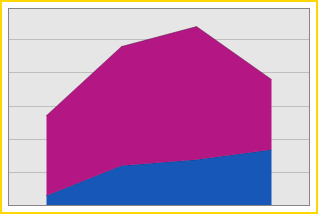 |
Stacked Area – is chart that shows two or more series stacked in a vertical manner filled with an area. |
 |
Full Stacked Area – displays the series of areas in a diagram where each value of the data points are stacked with all the other corresponding data point’s values. |
 |
Stacked Spline Area – is a chart that is a variation of the spline area chart. |
 |
Range Area – displays series of values filled with areas on a diagram by plotting both X and Y axis with upper and lower bounds as maximum and minimum limits, respectively. |
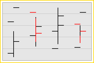 |
Stock – represents variation of the stock prices within the day.The top and bottom values shown at each point value represents the high and low prices of the stocks whereas the left and right tick marks corresponds to the open and close prices. |
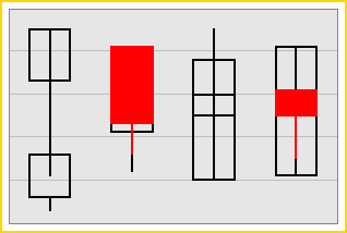 |
Candle Stick – used to show variation of the stock prices within the course of a day. This is similar to the Stock Charts but the top and bottom values are displayed in a rectangular form. The body(rectangular shaoed data) depends upon how the stock closes and opens against its opening price; the body is filled when the stock closes lower that its opening price, otherwise, you can see a hollow body in the diagram. |
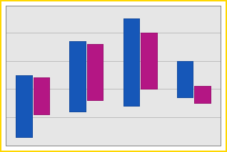 |
Side by Side Range Bar – this chart can either be displayed horizontally or vertically and is useful for showing activity bars from different series with various argument types or parameters. |
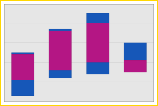 |
Range Bar – is a group of data series stacked vertically and can be combined into groups shown side by side across the same axis. |
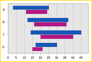 |
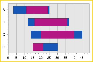
Side by Side Gantt – is a chart that displays horizontal bars along the time axis where each bar is represented by a separate event with the start and end values. This chart is helpful when plotting values showing activity bars from different series above one another comparing their duration similar to the activities found in the CRM module. |
 |
Gantt – is chart that displays similar to bar type but which can be used when showing schedule status side by side. |
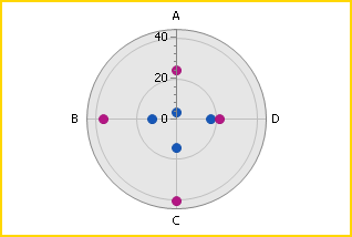 |
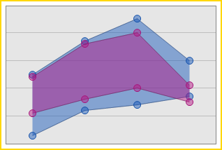
Radar Point – is a chart that displays data points from two or more different series on the same field or parameters on a circular grid. This can be shown in multiple axes along which the data can be plotted. |
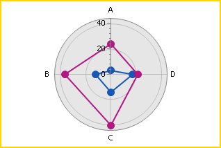 |
Radar Line – is chart similar to radar point chart but the data points within the circular grid are connected together through a line. |
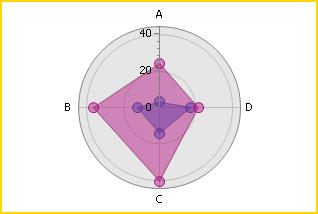 |
Radar Area – is also a radar line chart but with values filled in with an area. |
| 3D Charts | |
 |
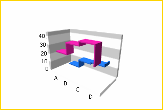
Bar 3D – is a Bar chart represented in a 3D look where a series of X, Y and Z axis is grouped by category with which the length of the bar is determined by the value of the series. |
 |
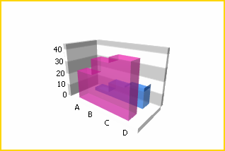
Stacked Bar 3D – is a Stacked Bar in 3D look that displays all points from different series that is stacked in single bar. The length of the bar is determined by combined values of the series for each category. |
 |
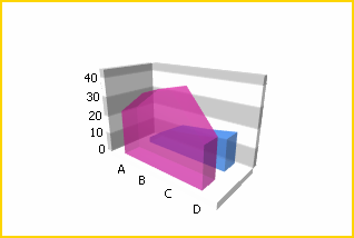
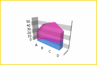
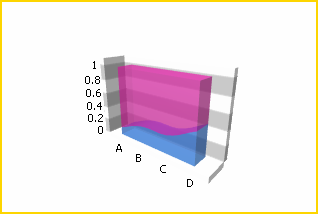
Full Stacked Bar 3D – is a Full Stacked Bar in 3D look that displays all series stacked in a single bar for each category in which the height of each bar is always the full height of the chart diagram. |
 |
Manhattan Bar – is a Full Stacked Bar in 3D look that displays series of individual bars grouped by category. |
 |
Side by Side Stacked Bar 3D – is a Side by Side Stacked Bar chart in 3D look that combines the stacked bar and the side by side bar chart. It is helpful when stacking different bars and combines them into groups shown side by side across one same axis. |
 |
Pie 3D – is a Pie chart in 3D look that displays sets of pie charts with series’ values displayed in percentages. |
 |
Doughnut 3D – is a Doughnut chart in 3D look that compares percentage values of the same series but is easier to understand due to the display of the sliced pie with a hole at the center. |
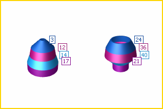 |
Funnel 3D - displays a wide area at the top which indicates the total point’s value, while other areas are proportionally smaller. This chart is potentially helpful in identifying problems in an organizations’ sales processes. |
 |
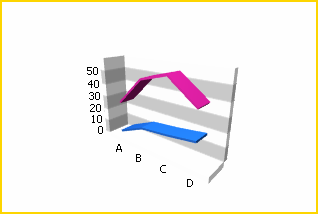
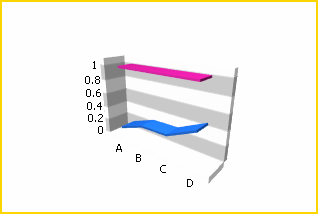
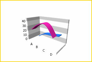
Line 3D – is a Line chart in 3D look that shows trends for several data on the same diagram plotted against the x, y and z axes. |
 |
Stacked Line 3D – is a Stacked Line chart in 3D look that displays all points from different series but with the same argument in a stacked manner. It is useful when comparing how much each of the data series adds to the sum of the aggregate value for a specific column or row value. |
 |
Full Stacked Line 3D – is a Full Stacked Line chart in 3D look that is helpful when comparing how much each of the series sums up to the value for specific value x, y and z axes. |
 |
Step Line 3D – is a Spline chart in 3D look that is useful when tracking data changes over time. |
 |
Area 3D – is an Area chart in 3D look that displays data series as filled areas in the diagram. Each point is displayed as peak or hollow in the area depending on the value of the data points. |
 |
Stacked Area 3D – is a Stacked Area chart in 3D look that displays three or more series stacked vertically with a filled area. |
 |
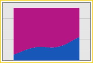
Full Stacked Area 3D – is a Full Stacked Area chart in 3D look that displays displays the series of areas in a diagram where each value of the data points are stacked with all the other corresponding data point’s values. |
 |
Step Area 3D – is a Step Area in 3D look that represents series of the same data in a step lines filled with an area. |
 |
Spline 3D – is a Spline chart in 3D look that is specifically used for plotting curves through data points |
 |
Spline Area 3D – is a Spline Area chart in 3D look that is specifically used for plotting curves through data points but with area filled in. |
 |
Full Stacked Spline Area 3D - charts that are specifically used for plotting curves through data points but with area filled in the diagram. |
 |
Range Area 3D - is a group of data series stacked vertically and can be combined into groups shown side by side across the same axis. |

Learn more about how to customize the Pivot Grid and configure its preferences.
See More: Format the Pivot Grid
![]()